Tab panels
Tab panels let users switch between views in the same context.
On this page
On this page
Usage
Tab panels are used to group related content into views that are shown and hidden. Each view has a corresponding tab that provides a label and controls the panel's visibility.
Tabs in a tab panel should not be links that navigate the user to a new URL. If you want tab-like navigation, use a tab nav instead.
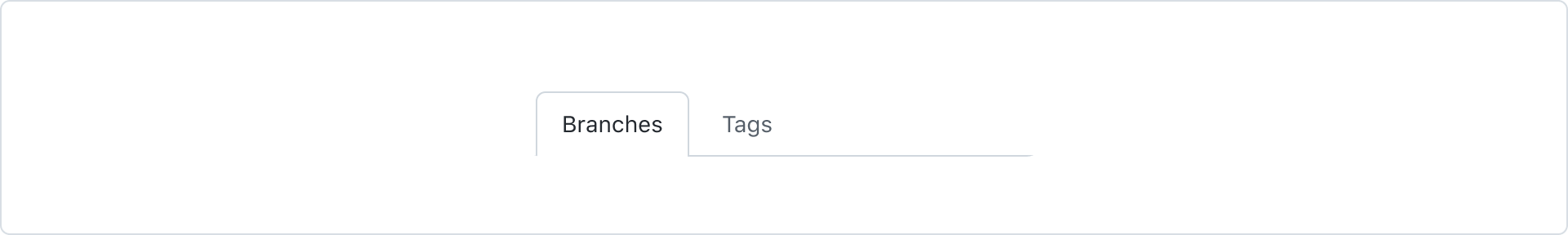
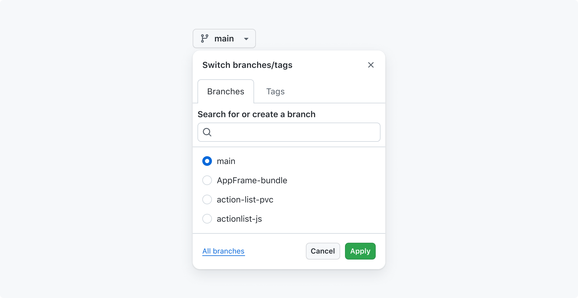
For example, a tab panel is used to switch between the "Branches" and "Tags" views in the branch selection dialog.
Best practices
The same best practices apply to tab panels as they do to tab nav.
Anatomy
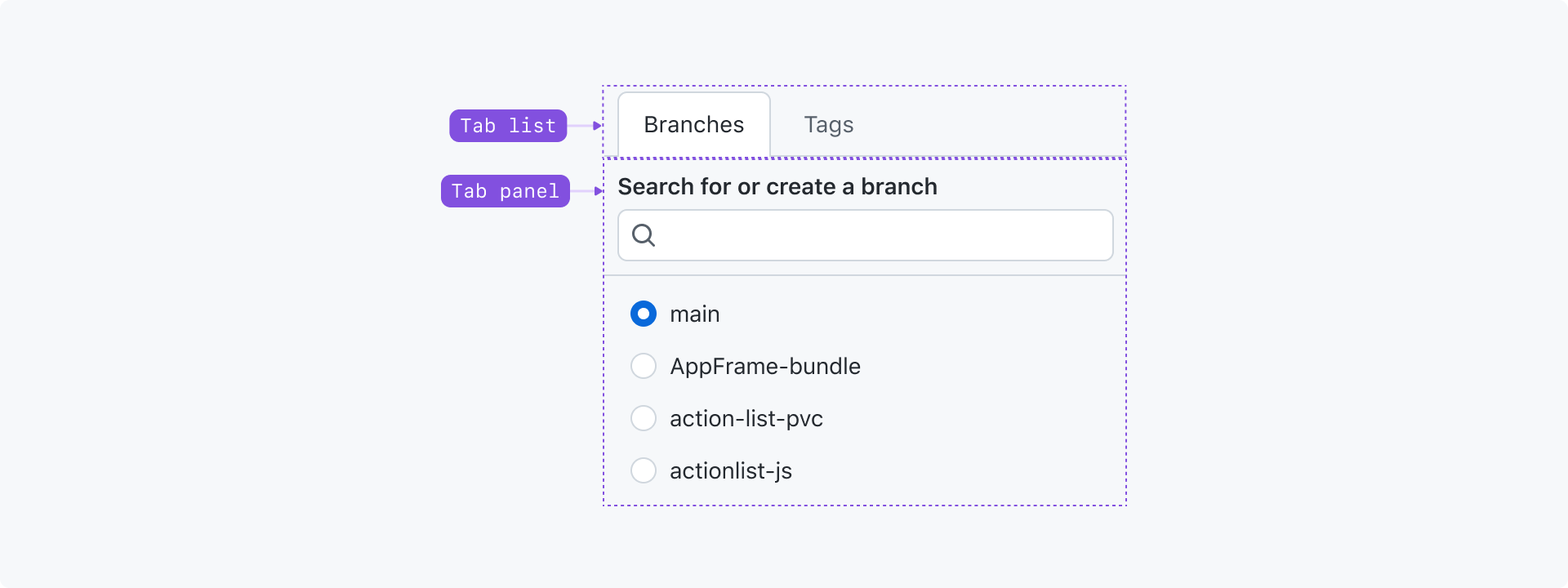
Tab list: A set of buttons used to switch between views. Each tab should concisely label the view it's associated with.
Tab panel: The view associated with the active tab.
Options
The same options are available to tab panels as they are to tab nav.
Accessibility
Keyboard navigation
Tabs, like all interactive elements, can be activated using a cursor or keyboard.
When a user moves focus into the tablist using the Tab key, the active tab should be focused. A tablist is only a single Tab stop. Once focused, navigation through the tablist can then conducted with Left, Right, Home, and End keypresses.
Other a11y guidance
Tab nav and tab panels are almost identical. Reference the tab nav accessibility guidelines for more guidance.
| Key(s) | Description |
|---|---|
| Tab | Moves focus from the tablist to the tab panel or next focusable node. |
| Enter | Activates the focused tab. |
| ArrowLeft | Activates the previous tab. If a user is focused on the first tab, wrap to activate the last tab. |
| ArrowRight | Activates the mext tab. If a user is focused on the last tab, wrap to activate the first tab. |