Text input with tokens
Text input with tokens is an input for a value that is a list.
On this page
On this page

Usage
Use a text input with tokens for a value that is a list. Items can be added or removed from the list, but the individual items cannot be edited inline.
This kind of input is most commonly used with an autocomplete to let users select items from a predetermined list of options.
Anatomy
Same as the text input, but the input's value is a list instead of a single string of text.
Options
The text input can be configured with all of the same options as the regular text input component.
Wrapping

The list of tokens can be constrained to a single line or be wrapped to multiple lines. When wrapping is disabled and the list exceed the width of the input, the input will scroll horizontally.
Max height

When tokens wrap, the height of the input can be constrained to a maximum height. Once the rows exceed the maximum height, the input will scroll vertically.
Truncation

You may choose to limit the number of tokens that are visible. However, all tokens will be visible while the text input is focused.
Token variants
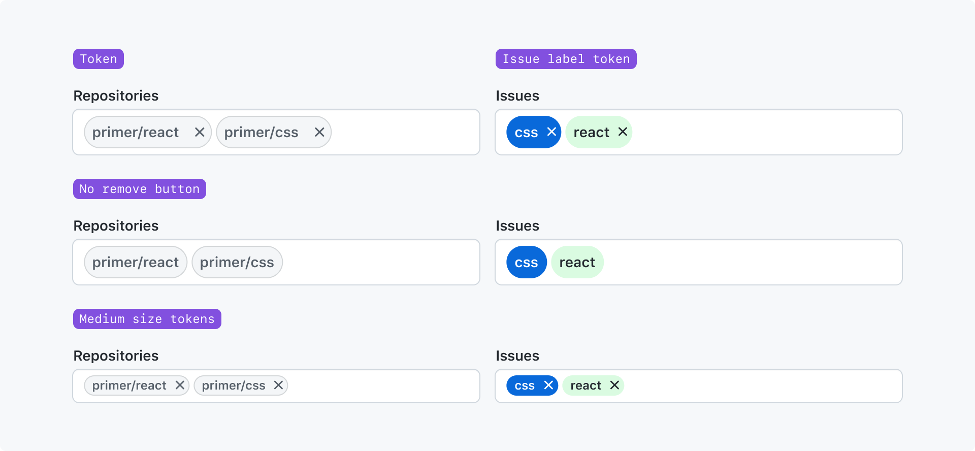
You may choose any of Primer's token components, but you cannot mix different token components in a single input. You may also choose the size of the tokens and whether or not the token's remove button is shown.
Interactions
Move focus between tokens
When tabbing to the input, the <input /> element receives focus. Then, when the text cursor is at the beginning of
the input, users can use the Left Arrow key to move focus to the last token. Once any token has focus, users can
use the Right Arrow and Left Arrow key to move focus to the previous or next token.
Remove tokens
A token may be removed by focusing it and pressing the Backspace key, or by clicking the token's remove button.
If a user keys Backspace and the text cursor is at the begining of the input, the last token will be removed but
the input will be populated with it's text value.